发布时间:2021-07-07
使应用程序更有趣并同时显示更多信息而不需要额外空间,其中一种方式是将其呈现在同一页面的轮播中。
如果添加定位指标,这种情况下的用户体验会好得多。例如如果正在查看图像相册,那么用户可以看到指示符,在本文中我们将看到如何使用IndicatorView实现这一目标!
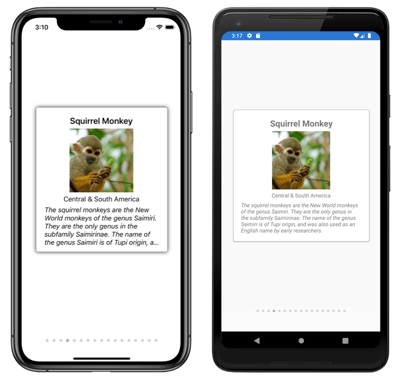
该控件允许我们显示指标来表示 CarouselView 中项目的总数和当前位置。 它包含由 BindableProperty 对象支持的属性,允许我们使用数据绑定。 重要的是要知道此控件在 iOS 和 Android 平台上的 Xamarin.Forms 4.4 和通用 Windows 平台上的 4.5 中可用。
要开始创建此控件,了解所需的结构很重要:
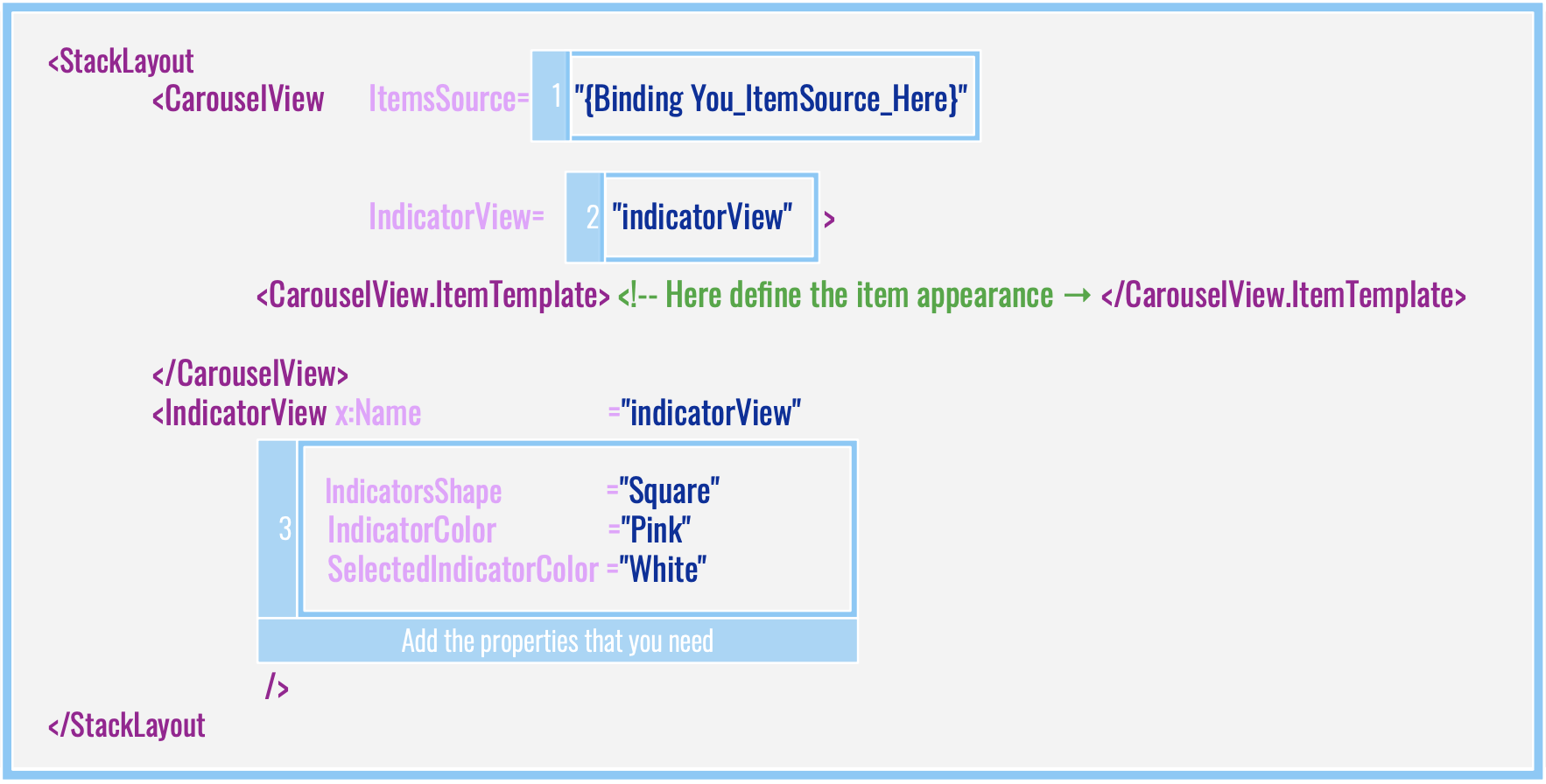
代码实现:
<StackLayout>
<CarouselView ItemsSource="{Binding Food}"
IndicatorView="indicatorView">
<CarouselView.ItemTemplate>
<!-- Here define the item appearance -->
</CarouselView.ItemTemplate>
</CarouselView>
<IndicatorView x:Name="indicatorView"
IndicatorColor="LightGray"
SelectedIndicatorColor="DarkGray"
HorizontalOptions="Center" />
</StackLayout>
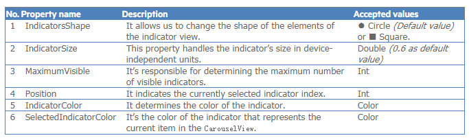
IndicatorView提供了许多可以用来创建实用功能的属性:
最后,添加这些属性的示例:
<IndicatorView x:Name="indicatorView"
IndicatorColor="Pink"
SelectedIndicatorColor="White"
HorizontalOptions="Center"
IndicatorsShape="Square"
IndicatorSize="18"
MaximumVisible="6"
.... Here you can add all the properties that you need..../>
要定义指标元素,您只需将 IndicatorView.IndicatorTemplateproperty 设置为 DataTemplate。
在以下示例中,默认图像已更改为另一个名为 Star.jpg 的图像。
<IndicatorView.IndicatorTemplate>
<DataTemplate>
<Image Source="Star.jpg" />
</DataTemplate>
</IndicatorView.IndicatorTemplate>
要实现完整的实现,只需将前一个块添加到此:
<StackLayout>
<CarouselView ItemsSource="{Binding Food}"
IndicatorView="indicatorView">
<CarouselView.ItemTemplate>
<!-- DataTemplate that defines item appearance -->
</CarouselView.ItemTemplate>
</CarouselView>
<IndicatorView x:Name="indicatorView"
IndicatorColor="LightGray"
SelectedIndicatorColor="Black"
HorizontalOptions="Center">

<!-- Here add the block explained above-->
</IndicatorView>
</StackLayout>
可视化状态非常重要,它帮助我们以图形方式识别特定操作所做的任何更改。 例如,在指示器视图中,我们可以通过与其他项目不同的颜色或大小来突出显示项目被选中的时间,这使得可以快速识别所在的位置。
为了开发这个例子,一步一步地解释:
1. 创建样式。
<Style x:Key="IndicatorsStyle"
TargetType="Label">
<Setter Property="VisualStateManager.VisualStateGroups">
<VisualStateGroupList>
<VisualStateGroup x:Name="CommonStates">
<VisualState x:Name="Normal">
<VisualState.Setters>
<Setter Property="TextColor"
Value="Pink" />
</VisualState.Setters>
</VisualState>
<VisualState x:Name="Selected">
<VisualState.Setters>
<Setter Property="TextColor"
Value="Blue" />
</VisualState.Setters>
</VisualState>
</VisualStateGroup>
</VisualStateGroupList>
</Setter>
</Style>
2. 创建样式后,您只需添加一个简单的样式,如下所述:
<IndicatorView x:Name="indicatorView"
Margin="0,0,0,40"
IndicatorColor="Transparent"
SelectedIndicatorColor="Transparent"
HorizontalOptions="Center">
<IndicatorView.IndicatorTemplate>
<DataTemplate>
<Label Text="-" Style="{StaticResource IndicatorsStyle}" />
</DataTemplate>
</IndicatorView.IndicatorTemplate>
</IndicatorView>
Telerik UI for Xamarin是一个构建跨平台移动应用程序的原生UI。Telerik UI for Xamarin使用Xamarin.Forms技术,它可以让开发人员从一个单一的共享C#代码库中创建原生的iOS、Android和Windows Phone应用程序。不仅如此,UI for Xamarin建立在iOS和Android的原生控件之上的,为Xamarin用户的应用程序提供真正的原生UI。
了解最新Kendo UI最新资讯,请关注Telerik中文网!

 023-68661681
 返回
返回