发布时间:2022-07-26
Kendo UI for Vue Button提供了可点击的UI功能,使您能够仅显示文本内容,或显示预定义的图标、图像和自定义图标,并呈现文本和图像内容的组合。
Kendo UI for Vue Button组件是Kendo UI for Vue库中的Vue UI组件部分,它通过kendo-vue-buttons包下的NPM分发。
下面的示例演示了 Button 的作用。
main.vue
<template>
<div class="row example-wrapper">
<div class="col-xs-12 col-sm-6 example-col">
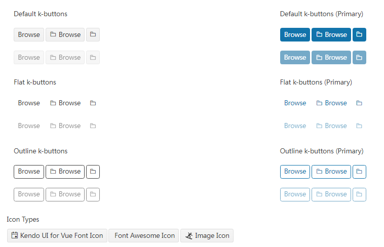
<p>Default k-buttons</p>
<p>
<kbutton>Browse</kbutton>
<kbutton :icon="'folder'">Browse</kbutton>
<kbutton :icon="'folder'"></kbutton>
</p>
<p>
<kbutton :disabled="true">Browse</kbutton>
<kbutton :icon="'folder'" :disabled="true">Browse</kbutton>
<kbutton :icon="'folder'" :disabled="true"></kbutton>
</p>
</div>
<div class="col-xs-12 col-sm-6 example-col">
<p>Default k-buttons (Primary)</p>
<p>
<kbutton :theme-color="'primary'">Browse</kbutton>
<kbutton :icon="'folder'" :theme-color="'primary'">Browse</kbutton>
<kbutton :icon="'folder'" :theme-color="'primary'"></kbutton>
</p>
<p>
<kbutton :theme-color="'primary'" :disabled="true">Browse</kbutton>
<kbutton :icon="'folder'" :theme-color="'primary'" :disabled="true"
>Browse</kbutton
>
<kbutton
:icon="'folder'"
:theme-color="'primary'"
:disabled="true"
></kbutton>
</p>
</div>
<div class="col-xs-12 col-sm-6 example-col">
<p>Flat k-buttons</p>
<p>
<kbutton :fill-mode="'flat'">Browse</kbutton>
<kbutton :icon="'folder'" :fill-mode="'flat'">Browse</kbutton>
<kbutton :icon="'folder'" :fill-mode="'flat'"></kbutton>
</p>
<p>
<kbutton :fill-mode="'flat'" :disabled="true">Browse</kbutton>
<kbutton :icon="'folder'" :fill-mode="'flat'" :disabled="true"
>Browse</kbutton
>
<kbutton
:icon="'folder'"
:fill-mode="'flat'"
:disabled="true"
></kbutton>
</p>
</div>
<div class="col-xs-12 col-sm-6 example-col">
<p>Flat k-buttons (Primary)</p>
<p>
<kbutton :theme-color="'primary'" :fill-mode="'flat'">Browse</kbutton>
<kbutton :icon="'folder'" :theme-color="'primary'" :fill-mode="'flat'"
>Browse</kbutton
>
<kbutton
:icon="'folder'"
:theme-color="'primary'"
:fill-mode="'flat'"
></kbutton>
</p>
<p>
<kbutton :theme-color="'primary'" :fill-mode="'flat'" :disabled="true"
>Browse</kbutton
>
<kbutton
:icon="'folder'"
:theme-color="'primary'"
:fill-mode="'flat'"
:disabled="true"
>Browse</kbutton
>
<kbutton
:icon="'folder'"
:theme-color="'primary'"
:fill-mode="'flat'"
:disabled="true"
></kbutton>
</p>
</div>
<div class="col-xs-12 col-sm-6 example-col">
<p>Outline k-buttons</p>
<p>
<kbutton :fill-mode="'outline'">Browse</kbutton>
<kbutton :icon="'folder'" :fill-mode="'outline'">Browse</kbutton>
<kbutton :icon="'folder'" :fill-mode="'outline'"></kbutton>
</p>
<p>
<kbutton :fill-mode="'outline'" :disabled="true">Browse</kbutton>
<kbutton :icon="'folder'" :fill-mode="'outline'" :disabled="true"
>Browse</kbutton
>
<kbutton
:icon="'folder'"
:fill-mode="'outline'"
:disabled="true"
></kbutton>
</p>
</div>
<div class="col-xs-12 col-sm-6 example-col">
<p>Outline k-buttons (Primary)</p>
<p>
<kbutton :theme-color="'primary'" :fill-mode="'outline'"
>Browse</kbutton
>
<kbutton
:icon="'folder'"
:theme-color="'primary'"
:fill-mode="'outline'"
>Browse</kbutton
>
<kbutton
:icon="'folder'"
:theme-color="'primary'"
:fill-mode="'outline'"
></kbutton>
</p>
<p>
<kbutton
:theme-color="'primary'"
:fill-mode="'outline'"
:disabled="true"
>Browse</kbutton
>
<kbutton
:icon="'folder'"
:theme-color="'primary'"
:fill-mode="'outline'"
:disabled="true"
>Browse</kbutton
>
<kbutton
:icon="'folder'"
:theme-color="'primary'"
:fill-mode="'outline'"
:disabled="true"
></kbutton>
</p>
</div>
<div class="col-xs-12 example-col">
<p>Icon Types</p>
<kbutton :icon="'calendar'">Kendo UI for Vue Font Icon</kbutton>
<kbutton :icon-class="'fa fa-calendar fa-fw'">Font Awesome Icon</kbutton>
<kbutton
:image-url="'https://demos.telerik.com/kendo-ui/content/shared/icons/sports/snowboarding.png'"
>Image Icon</kbutton
>
</div>
</div>
</template>
<script>
import { Button, ButtonGroup } from '@progress/kendo-vue-buttons';
export default {
components: {
kbutton: Button,
buttongroup: ButtonGroup,
},
};
</script>
<style scoped>
.k-button {
margin-right: 3px;
}
.k-button > .k-image {
width: 20px;
height: 20px;
}
</style>
main.js
import { createApp } from 'vue'
import App from './main.vue'

createApp(App).mount('#app')
下面的示例演示了基本的 Button 事件。
main.vue
<template>
<div class="example-config">
<kbutton
@click="handleDomEvent"
@mousedown="handleDomEvent"
@mouseup="handleDomEvent"
@focus="handleDomEvent"
@blur="handleDomEvent"
@keypress="handleDomEvent"
>
My Button
</kbutton>
<h5>{{title}}</h5>
<ul class="event-log">
<li v-for="log in logs" :key="log">{{log}}</li>
</ul>
</div>
</template>
<script>
import { Button } from '@progress/kendo-vue-buttons';

export default {
components: {
'kbutton': Button
},
data () {
return {
logs: []
};
},
methods: {
handleDomEvent (event) {
this.logs.unshift(event.type);
}
}
}
</script>
main.js
import { createApp } from 'vue'
import App from './main.vue'

createApp(App).mount('#app')
Kendo UI致力于新的开发,来满足不断变化的需求。Kendo UI for Vue使用旨在提高性能和丰富用户体验的Vue组件,帮助开发人员构建下一代应用程序。它是为Vue技术框架提供可用的Kendo UI组件,以便更快地构建更好的Vue应用程序。
Telerik_KendoUI产品技术交流群:726377843 欢迎一起进群讨论
了解最新Kendo UI最新资讯,请关注Telerik中文网!

 023-68661681
 返回
返回