发布时间:2022-08-17
Kendo UI致力于新的开发,来满足不断变化的需求。Kendo UI for Vue使用旨在提高性能和丰富用户体验的Vue组件,帮助开发人员构建下一代应用程序。它是为Vue技术框架提供可用的Kendo UI组件,以便更快地构建更好的Vue应用程序。
您可以通过向其添加图像、预定义或自定义图标来增强 Button 的文本内容。
从 Web 标准的角度来看,最好使用背景图像,因为图标用于装饰而不是表示结构内容。
Button提供以下选项:
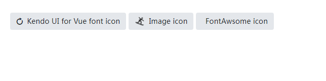
下面的示例演示如何在 Button 中使用不同类型的图标。
main.vue
<template>
<div>
<kbutton :icon="'refresh'">Kendo UI for Vue font icon</kbutton>
<kbutton :image-url="'https://demos.telerik.com/kendo-ui/content/shared/icons/sports/snowboarding.png'">Image icon</kbutton>
<kbutton :icon-class="'fa fa-key fa-fw'">FontAwsome icon</kbutton>
</div>
</template>
<script>
import { Button } from '@progress/kendo-vue-buttons';

export default {
components: {
'kbutton': Button
}
}
</script>
<style>
.k-button + .k-button {
margin-left: 5px
}
</style>
main.js
import { createApp } from 'vue'
import App from './main.vue'

createApp(App).mount('#app')
Telerik_KendoUI产品技术交流群:726377843 欢迎一起进群讨论
了解最新Kendo UI最新资讯,请关注Telerik中文网!

 023-68661681
 返回
返回