发布时间:2022-08-25
Kendo UI for Vue原生组件——Button 提供了一组预定义的外观选项。除了 Button 的默认外观之外,这些替代样式选项使您能够配置组件外观的每个单独方面。
在上文中,我们为大家介绍了如何配置器演示、按钮大小形状设置等,点击这里回顾>>
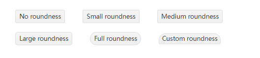
Button的圆度通过其rounded属性控制,可以传递给属性的值如下:
以下示例演示了每个舍入选项的用法:
main.vue
<template>
<div>
<span class="wrapper">
<kbutton>No roundness</kbutton>
</span>
<span class="wrapper">
<kbutton :rounded="'small'">Small roundness</kbutton>
</span>
<span class="wrapper">
<kbutton :rounded="'medium'">Medium roundness</kbutton>
</span>
<br />
<br />
<span class="wrapper">
<kbutton :rounded="'large'">Large roundness</kbutton>
</span>
<span class="wrapper">
<kbutton :rounded="'full'">Full roundness</kbutton>
</span>
<span class="wrapper">
<kbutton :size="null" :class="'custom-roundness'">Custom roundness</kbutton>
</span>
</div>
</template>

<script>
import { Button } from '@progress/kendo-vue-buttons';

export default {
components: {
kbutton: Button,
}
};
</script>
<style>
.custom-roundness.k-button {
border-top-right-radius: 15px;
border-top-left-radius: 15px;
}

.wrapper {
padding: 20px;
}
</style>
main.js
import { createApp } from 'vue'
import App from './main.vue'

createApp(App).mount('#app')
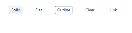
Button的样式是通过其 fillMode 属性控制的,可以传递给属性的值如下:
以下示例演示了每个 fillMode 选项的用法:
main.vue
<template>
<div>
<span class="wrapper">
<kbutton :fill-mode="'solid'">Solid</kbutton>
</span>
<span class="wrapper">
<kbutton :fill-mode="'flat'">Flat</kbutton>
</span>
<span class="wrapper">
<kbutton :fill-mode="'outline'">Outline</kbutton>
</span>
<span class="wrapper">
<kbutton :fill-mode="'clear'">Clear</kbutton>
</span>
<span class="wrapper">
<kbutton :fill-mode="'link'">Link</kbutton>
</span>
</div>
</template>

<script>
import { Button } from '@progress/kendo-vue-buttons';

export default {
components: {
kbutton: Button,
},
};
</script>
<style>
.wrapper {
padding: 20px;
}
</style>
main.js
import { createApp } from 'vue'
import App from './main.vue'

createApp(App).mount('#app')
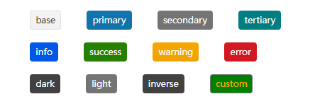
Button 的颜色是通过其 themeColor 属性控制的。
以下示例演示了每个 themeColor 选项的用法:
main.vue
<template>
<div>
<span class="wrapper">
<kbutton :theme-color="'base'">base</kbutton>
</span>
<span class="wrapper">
<kbutton :theme-color="'primary'">primary</kbutton>
</span>
<span class="wrapper">
<kbutton :theme-color="'secondary'">secondary</kbutton>
</span>
<span class="wrapper">
<kbutton :theme-color="'tertiary'">tertiary</kbutton>
</span>
<br />
<br />
<span class="wrapper">
<kbutton :theme-color="'info'">info</kbutton>
</span>
<span class="wrapper">
<kbutton :theme-color="'success'">success</kbutton>
</span>
<span class="wrapper">
<kbutton :theme-color="'warning'">warning</kbutton>
</span>
<span class="wrapper">
<kbutton :theme-color="'error'">error</kbutton>
</span>
<br />
<br />
<span class="wrapper">
<kbutton :theme-color="'dark'">dark</kbutton>
</span>
<span class="wrapper">
<kbutton :theme-color="'light'">light</kbutton>
</span>
<span class="wrapper">
<kbutton :theme-color="'inverse'">inverse</kbutton>
</span>
<span class="wrapper">
<kbutton :theme-color="null" :class="'custom-color'">custom</kbutton>
</span>
</div>
</template>

<script>
import { Button } from '@progress/kendo-vue-buttons';

export default {
components: {
kbutton: Button,
}
};
</script>
<style>
.wrapper {
padding: 20px;
}

.custom-color {
background-color: green;
color: orange;
}
</style>
main.js
import { createApp } from 'vue'
import App from './main.vue'

createApp(App).mount('#app')
Telerik_KendoUI产品技术交流群:726377843 欢迎一起进群讨论
了解最新Kendo UI最新资讯,请关注Telerik中文网!

 023-68661681
 返回
返回